Research:
- Held group and one-on-one sessions with each of the sub-service line product owner(s) to determine the number of sites each owns and the major purpose/audience of each.
- What assets gets transitioned over or gets archived/deleted. I put together a simple spreadsheet to help each owner take inventory of their assets, what they are and used for.
- Analyze each website’s metrics over the past year to better understand health status, how each is being used and to help set our initial benchmark for strong goals and improvements.
- Of the websites that would be transitioned over, I created a brief questionnaire that was sent out to 5 - 10 users of each website to better understand how they interact with it.
- What will be the best way to communicate the changes coming to users, stakeholders and leadership?
- Implement user research techniques (interviews, contextual inquiry, usability testing, journey maps, user flows and user personas.
Results from research:
From the sessions with the owners I was able to make my recommendations to leadership what websites would to be included in the transformation, and which needed to be deleted. Product owners were given the option to archive or redesign others (in the new IA/UX produced for this project). I quickly realized through my data analysis and questionnaire, users of each site were basically getting there in the same ways with the same “key” goals in mind.
How:
- Bookmarks
- Links from various newsletters or other similar communication
- EY Home page (the main internal EY website)
Why:
- Read a highlighted service line or sector story
- Get tools and/or documents related to a past, current and future project
- Learn more about the business and/or new open roles
Getting everyone on the same page:
Bringing the site owners together to agree on anything was the main and most difficult hurdle. After my research I was able to illustrate how each user-base wasn’t as unique as they originally thought. In fact, the users and their needs for each site were very much in line. This helped us determine our strategic goals and come together as a single unit to deliver a high quality, easy to use website.
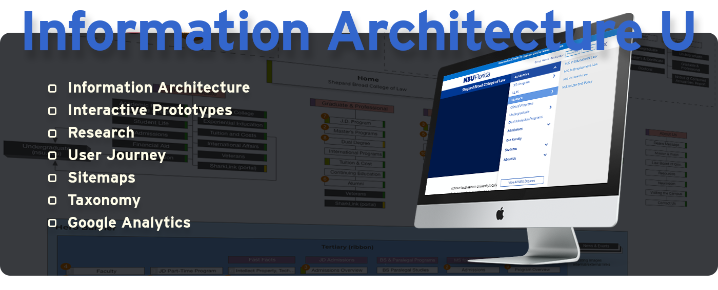
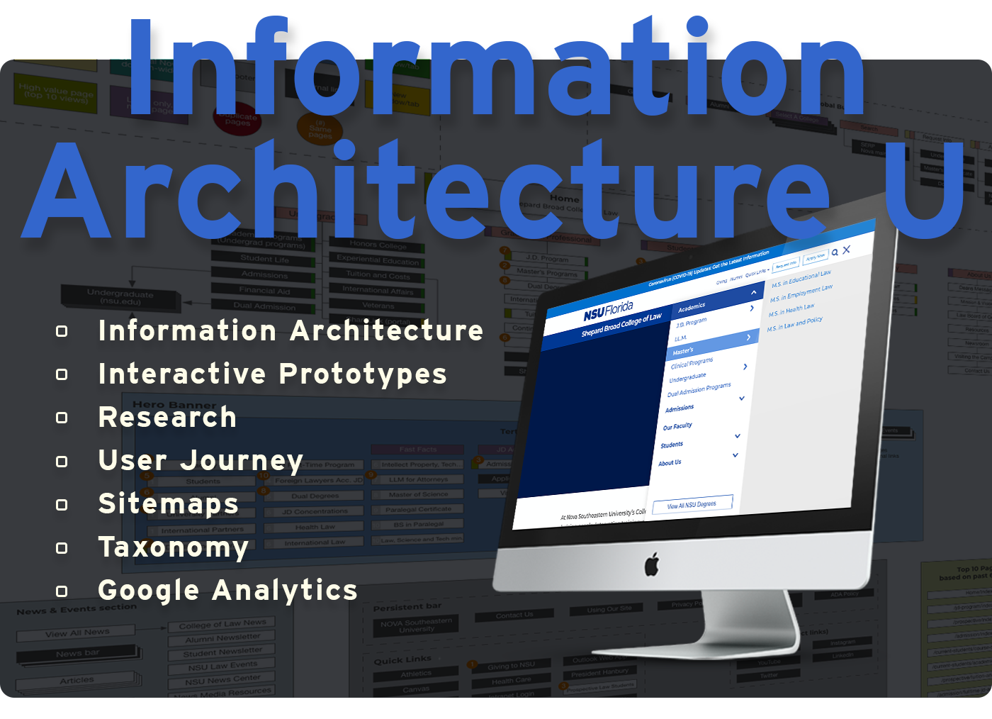
Information Architecture (IA):
Once I analyzed the data I gathered from the personas, I was able to find the patterns and capture the persona’s goals, needs, behaviors, concerns, experiences, likes, dislikes, etc. From this info (and the interviews), I felt we needed to keep the structure compact by splitting it into just a few major sections, making it quick and easy for our users to get the information they’re after. Using a combination of the EY hierarchy and industry standard terms/taxonomy we all happily signed off on a coherent structure that worked well for each sub-service line.
Wireframes:
The best way to explain how a website will look and function to leadership is visually. Leading weekly calls with the owners to illustrate design, functionality and progress helped keep everyone on task and excited about the future state of the new site.
Space was allocated for a secondary and tertiary navigation on the Desktop view. That secondary navigation, along with a hero image indicating site location (About, Working in, Comms, etc.) helps users visually identify their location within the site, quickly. I dropped the tertiary navigation in the mobile view, but the identifying visual, with secondary navigation remains prominent throughout the site.
Mock-ups / Prototypes:
I put together a series of mock-ups for the group to review and discuss. I walked them through each series, gathered their feedback then went back and tightened up. After agreeing as a group, I set up a prototype to really get them excited for things to come.
User testing:
Because the firm is global it was important to have a usability ‘test’ go out to users in each region, specifically targeting areas such as, the Far East, UK, US and parts of South America. I mocked up the site, with a few sections/pages, asking a few basic and advanced questions to get an idea how the initial layout, design and structure are perceived. I was able to secure a moderator in a few locations, but in others I had to rely on phone/video calls. That worked out very well and had some nice findings to share with the others.
Building a successful website:
In the end, a successful site was launched with a clean, creative layout and easy to navigate structure. We were able to successfully combine content from multiple business unites while making it a seamless and enjoyable experience across the board.


Companion Sites:
A number of companion websites were constructed based off my UI / UX Design. If I wasn’t leading the effort myself, I was easily able to package up the assets along with best practices and learning material. This along with my consultation, a suite of websites were transformed and constructed for the business unit. They were delivered ahead of the completion of the business transformation.