
Overview
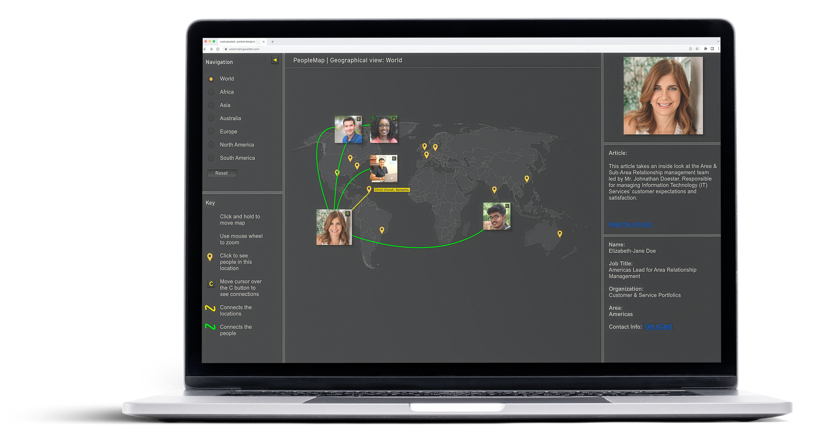
PeopleMap is a social and career relationship discovery tool designed to illustrate how closely connected employees are—even when spread across countries, time zones, and cultures. Inspired by the idea of six degrees of separation, the experience translates people and project relationships into an intuitive, visual map that encourages exploration and meaningful connection.
The idea originated informally during a conversation with a colleague: Wouldn’t it be interesting to actually see how we’re all connected across the organization? That question became the foundation for PeopleMap.
The application was built as a companion to a monthly IT newsletter distributed to EY’s global community. Each edition highlighted a team member and a high‑profile project. PeopleMap extended that story beyond text, turning it into an interactive experience that revealed who was involved, where they were located, and how they connected to others around the world.
The Challenge
Traditional org charts and internal directories did little to help employees understand real working relationships across a global organization. The challenge wasn’t just surfacing names—it was making relationships visible and approachable.
Research & Inshight
Because PeopleMap borrowed cues from social platforms, I began by examining enterprise social networks and tools already in use internally. I then shifted focus to the people themselves.
I conducted informal interviews and participatory design exercises with employees from the United States, India, Japan, and the UK. The goal was to understand how different cultures engage with social and collaborative tools at work.
A key insight emerged:
Participation varies by culture. Curiosity does not.
Some cultures were less inclined to actively participate in social platforms, while others embraced them. Across all regions, however, employees shared the same questions:
This insight shifted the design away from “social posting” and toward discovery—making PeopleMap feel purposeful, credible, and useful, rather than a novelty.
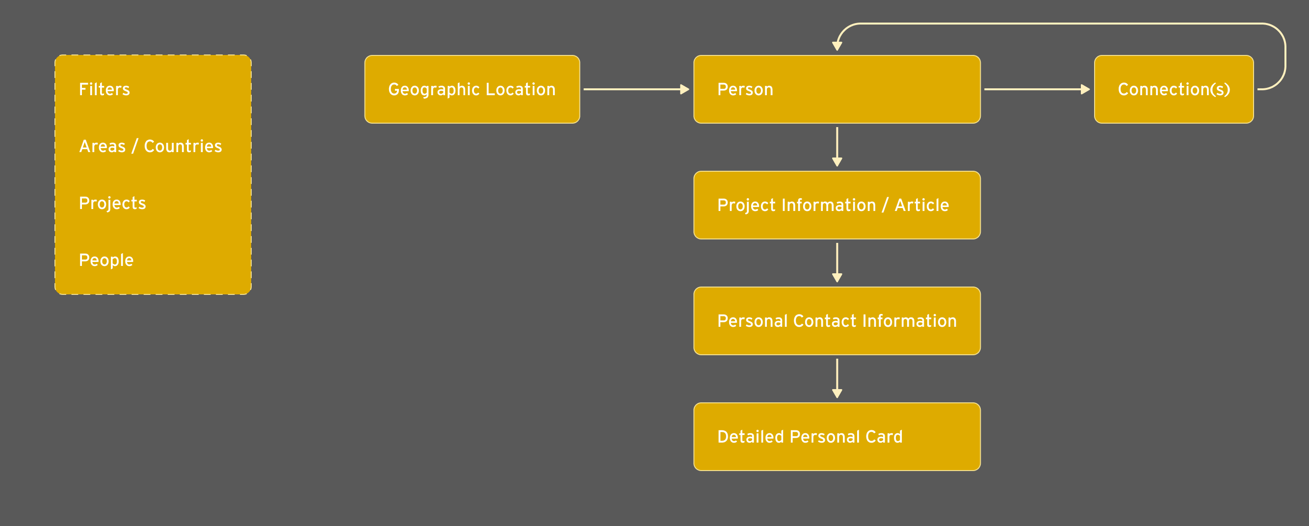
Information Architecture & Interaction Model
Working closely with the product manager, I started with information architecture to understand how users might navigate people, locations, and relationships. While the IA was a flat representation, it helped define the core interaction patterns and filtering logic that would later drive the visual experience.
The final product replaced traditional navigation with a primary visual canvas:


Data Strategy & Constraints
One of the largest challenges was sourcing relationship data at a global scale.
Early exploration of HR systems revealed significant limitations—regional data silos, heavy load times, and inconsistent connectivity across countries. Rather than force a brittle solution, I designed a deliberately low‑tech alternative.
A simple web form allowed communication leaders to enter a small set of key data points about each featured person and project. This information was stored in a lightweight SQL database, while profile details were pulled via existing corporate APIs.
This approach:
While not intended for massive scale, it was the right solution for an MVP focused on performance, accessibility, and global reach.
Usability Testing & Iteration
Given the tight timeline, usability testing ran in parallel with development. Interactive prototypes were tested with employees across multiple regions to validate concepts and uncover friction early.
Feedback from these sessions informed refinements to interaction patterns, visual clarity, and content hierarchy. Ongoing design reviews ensured the experience remained intuitive while supporting the underlying goal of relationship discovery.
Outcome & Reflection
PeopleMap launched successfully and was well received, particularly for its visual approach and ease of use. Follow‑up discussions with sub‑function teams revealed a consistent theme: employees wanted more—more people, more connections, more visibility.
Beyond the product itself, this project marked a turning point in my own growth as a designer. It was my first opportunity to work closely with colleagues across cultures and geographies, shaping my understanding of how differently people consume information—and how thoughtfully designed systems can bridge those differences.
PeopleMap reinforced a lesson I still carry forward:
Thoughtful design can make large organizations feel smaller, more human, and more connected—no matter how far apart we may be.


